图解:这 12 个“隐秘”的设计巧思,让字体更清晰!

01
A lower junction on the ‘r’ helps to differentiate the ‘rn’ from the ‘m’.
字母 r 笔画的连接点比 m 笔画连接点设置得更低一些,可以让读者更加容易区分 rn 和 m。

02
Many fonts mirror the ‘b’ to create the ‘p’ and ‘d’ which can be confusing.
在设计字母 p 和 d 时,避免将字母 b 直接水平或垂直镜像后生成 p 和 d,而是要在笔画连接处做一些区分。

03
Ascenders which extend higher than the cap height help to emphasise word patterns.
升部(ascender) 比大写字母高度(cap height)设置得更高一些,可以强化单词中字母的变化,提高辨识度。

04
A tail of the ‘Q’ that follows through helps to distinguish from the ‘O’
字母 Q 的小尾巴穿透圆圈,可以更加明显地和字母 O 区分。

05
Differentiation of often confused letterforms improve readability.
数字 1,i 的大写,L 的小写 ,这三个字符需要有明显的区分设计。

06
Balanced spacing allows us to read in saccades (rapid eye movement) effectively.
平衡的字母间距设置,更有利于速读。

07
Extended tails promote clearer letter shapes and character recognition.
适当延伸字母笔画的末端,可以让字母造型更清晰。

08
Emphasised dot size on the ‘i’ and ‘j’ accentuate recognition.
适当增大字母 i 和 j 上方的小点,可以让字母更易认。

09
Open terminals prevent shapes from appearing closed increasing clarity.
加大笔画末端的开口,避免看起来形似闭环,提高了清晰度。

10
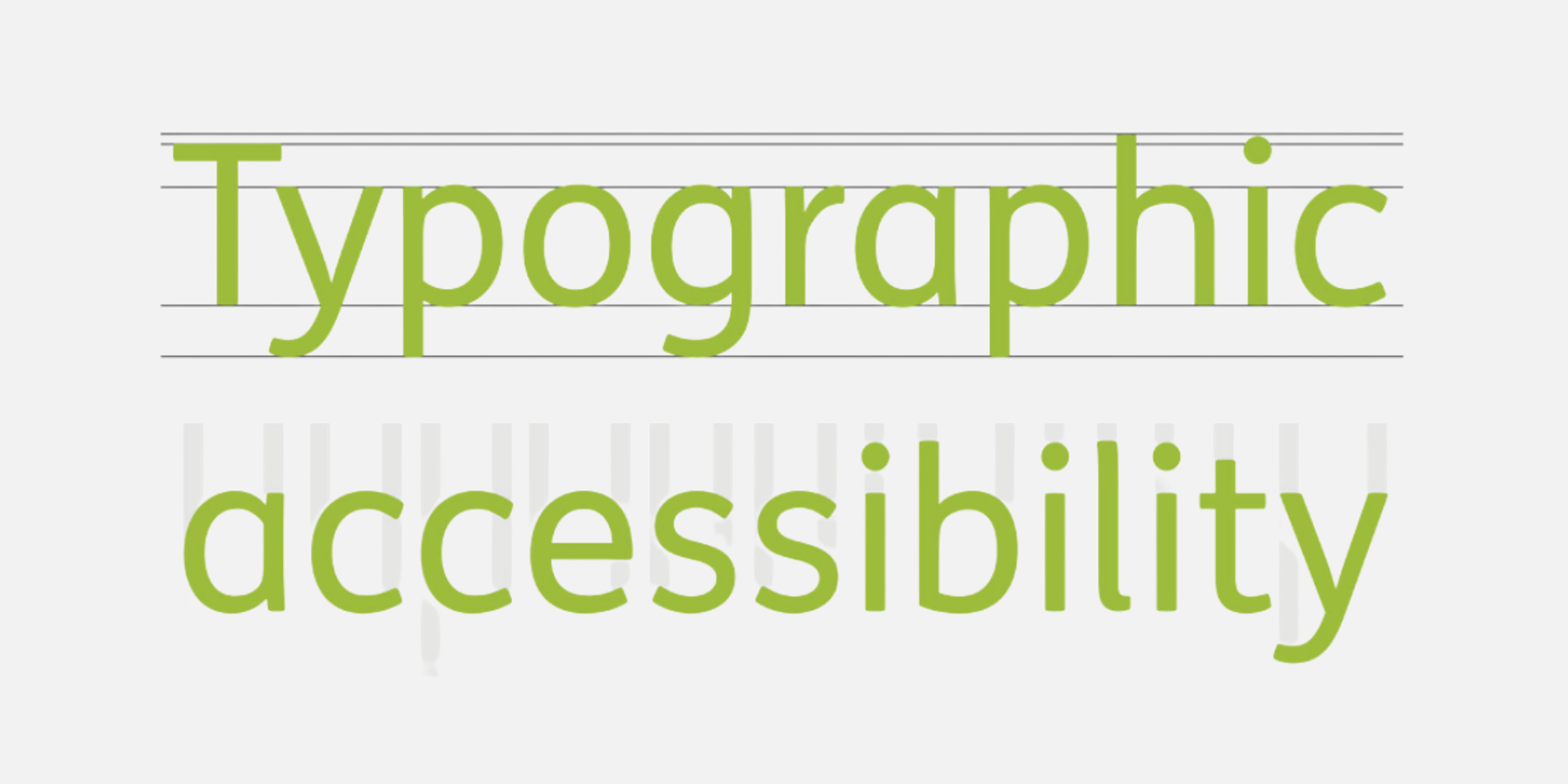
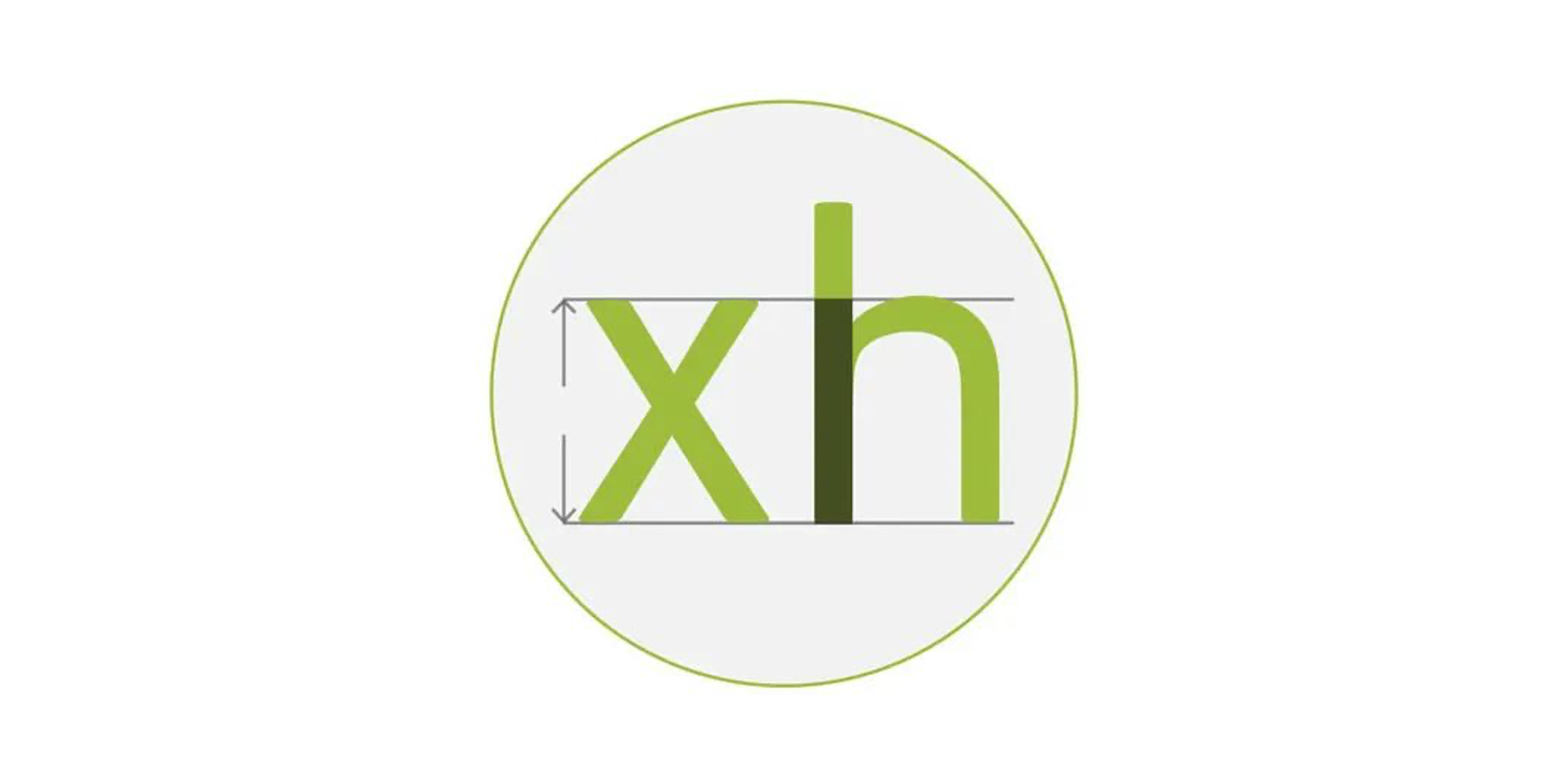
A large x-height enhances legibility by creating more space for lowercases letterforms.
更高的 x 高度让小写字母有更多空间,提高了整体的易认性。
11
A stem weight 17-20% of the x-height maximises legibility.
设置字干(stem)的高度时,在 x 高度基础之上增加 17-20%,易认性最佳。

12
Large open counters enhance legibility by reducing fill-in at smaller size.
更大的字腔(counter),让字母在小尺寸下更易认。